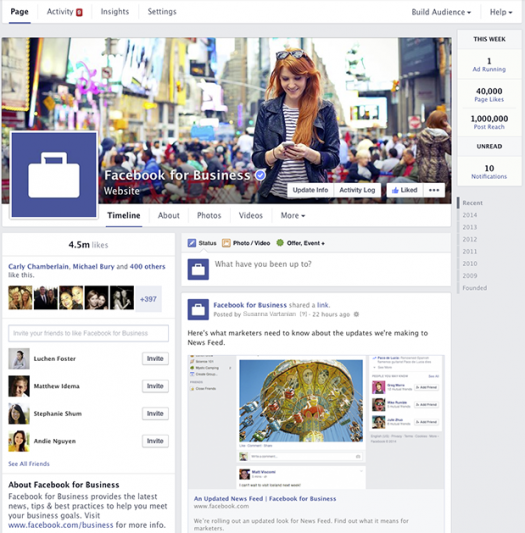
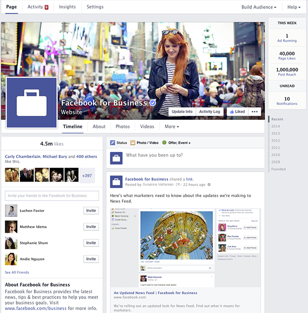
Over the past week, Facebook has been rolling out a new streamlined, one-column look for pages. Facebook reports the changes will “make it easier for people to find the information they want and help Page admins find the tools they use most.”

The changes include a return to the old two-column structure featuring static/admin content in the left-column and timeline posts in the right. You can keep an eye on the competition via the “Pages to Watch” feature which lets admins curate a list of similar Pages to, basically, watch and compare likes, reach and engagement. That’s a really great function with which to gauge your progress.
Our favorite feature is the streamlining of the admin panel. No more waiting for your entire Page to load before clicking the hide button! It’s also easier for our less tech-savvy clients to view and understand their insights via the updated navigation tabs at the top left – and you can also view weekly stats-at-a -glance in the far right.
This round of changes is definitely in our top 10. If you haven’t already been rolled over, be sure to click the “Join Waitlist” tab on your page. Finally, a Facebook change you’ll be glad to see!

